Secrets of Award-Winning Web Design: A Guide for Developers

User experience (UX) and user interface (UI) design are central to creating intuitive and engaging digital environments. These disciplines ensure a website is visually pleasing and easy to navigate, enhancing user interaction. Meanwhile, creative inspiration drives project innovation, pushing developers to adopt new technologies and methodologies.
This article delves into “A Guide for Developers,” which provides an essential roadmap for web developers. This guide emphasizes the critical components that shape the development landscape, including web design, web development, user experience, UI/UX design, and the pivotal role of creative inspiration.
Each element plays a unique role; web design focuses on the aesthetic and functional aspects that appeal to users, while web development involves the coding and programming that powers a website’s functionality.
This article aims to equip developers with valuable insights and practical guidance. Whether you’re refining your skills or just starting, this guide aims to inspire and inform your journey in the tech industry, helping you to create more effective, user-friendly, and aesthetically pleasing digital products.
Website Design Secrets to Know Before You Build a Site

In this section, we will look at ten crucial secrets to designing a website that is both effective and inviting. These tips are designed to improve how users experience your site and enhance the site’s overall performance. We will explore various important aspects, from making your site easy to use on mobile phones to ensuring it loads quickly, which can keep visitors happy and help your site stand out.
I. Prioritize Mobile-First Design

The mobile-first paradigm emphasizes the sequence of built and organized websites, ensuring that the mobile version comes first, then the rest of the devices (tablets and desktops). This practice is advantageous today because smartphones are the primary internet access source for many worldwide. The mobile-first design feature ensures that the contents are tweaked to fit media screens, providing an improved user experience with faster loading time, simplified navigation, and prioritized critical information.
This kind of approach is essential as it represents the behavior of users in performing these activities on the web today. While the mobile internet is overtaking desktops in many parts of the world, it is worth noting that users searching for products, shopping, and interacting primarily via mobile devices represent many users who need your business to be present online. Another factor that underlines how they harness the power is that Google and other search engines give mobile-first designs higher priority in ranking.
II. Responsive Web Design

Responsive web design (RWD) is an approach to design that makes web pages resize well on different devices and pour in various screen sizes. This specification allows a website to adapt its layout, visuals, and user interface inputs to fit the device on which it has been viewed. Adjustability also contributes to increasing usability, achieved by cross-platform interface compatibility regardless of the devices used, such as smartphones and large desktop monitors.
The role of reacting websites can never be underestimated, with it having a vast impact on usability, engagement, and accessibility. Hence, in the constantly changing landscape of devices and platforms that our visitors now face, websites must present their content in a functional way regardless of the device used to meet users’ expectations and perform well across all platforms. The responsive design ultimately leads to a highly user-friendly website, improving SEO rankings. Sites that adjust to users’ screens are less likely to have users leaving and less likely to average fewer conversions than the other.
Responsive websites are the basis of modern web development, and they need to fulfill the desires of the mobile world. Implementing these strategies helps ensure that all users, regardless of their choice of device, have a positive and seamless experience when interacting with your digital content.
III. Optimize for Speed

The loading speed of a website is critically important for both user satisfaction and search engine rankings, impacting nearly every aspect of a website’s success.
User Satisfaction
Fast-loading websites are essential for a good user experience. Users expect web pages to load quickly; delays can lead to frustration and increased bounce rates as users will likely abandon a site that loads after a few seconds. Studies show that even a one-second delay in page load time can lead to significant drops in page views, customer satisfaction, and conversions. Users value their time, and optimizing site speed enhances user engagement, retains visitors longer, and generally improves the user experience.
Search Engine Rankings
With Google at the forefront, search engines employ page speed as a ranking parameter. Websites with quick loading times are perceived as more reliable and, therefore, attract more visitors. This results in a better search ranking. Instead, Google intends to keep developing the best user experience; a website loading faster will probably get higher search results than a similar website with a slower load time. The fact is that it can be a crucial part of search engine optimization (SEO) actions to work on speeding up the website.
The site’s speed can be optimized by employing multiple techniques, such as reducing everything to the appropriate size of the image, using browser caching, decreasing the server’s response time, limiting the number of plugins, and using CDNs. Each step is soldered, utilizing the reduced data transferred during website visits, leading to improved loading time and a better user experience.
IV. Leverage White Space

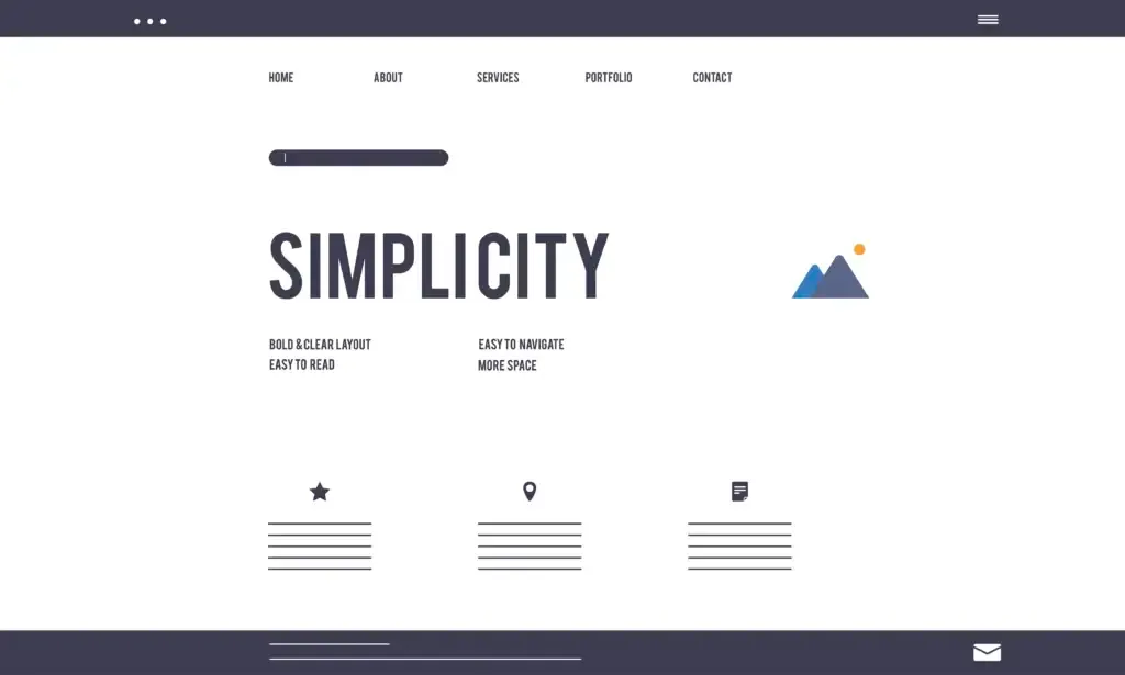
The idea of white space, the commonly used name for negative space, is an inherent design principle that works specifically with spacing around and between the webpage components. Contrary to the name white space, this refers not necessarily to actual white space in design but to any blank space area we need to provide. Its role is the greatest in terms of the appearance and usability of the website.
Enhancing Aesthetics
White space is one of the simplest ways to make a website graphically stunning. White space can communicate the impression of the high class by providing a space and breathing for the elements. It behaves as an ordering component by selecting elements vital for the design so that the composition looks much better and is not cluttered. This visual resolution enables the content to be more get-to-the-point and exciting.
Improving Readability
From a usability perspective, white space enhances the readability of text content. It helps define the layout by separating the various sections of a webpage, which aids in navigation and content consumption. By increasing the spacing between lines of text (leading) and around text blocks, users find reading and understanding the information more accessible. The strategic use of white space can reduce cognitive overload, making information processing smoother and faster.
Boosting User Interaction
Employing white space correctly on a website can create an interface that directs users through the site’s content, leading to a better user retention rate. It acts as a top-of-the-line prompt that makes things understandable to visitors, which is especially important when visitors are asked to take certain actions, such as signing up or making a purchase.
Web designers must balance white space to avoid extremes. Too much space might make the content feel sparse and disconnected, whereas too little can make the website cramped and chaotic. Proper use of white space is thus crucial for creating a clean, practical, and enjoyable web experience.
V. Use Visual Hierarchy

The concept of visual hierarchy in web design refers to the arrangement and presentation of visual elements in a way that influences the order in which the human eye perceives what it sees. This concept is crucial because it directly affects a user’s ability to navigate and digest information on a website efficiently and effectively.
Impact on Guiding Users' Attention
Techniques to Establish Visual Hierarchy
Several techniques can be employed to create a strong visual hierarchy:
1. Size: Larger elements naturally draw more attention than smaller ones. By varying the size of elements, designers can indicate which parts of the content are most important. For instance, headlines are often larger than body text to draw immediate attention.
2. Color: Colors can attract attention and evoke emotional responses. Bright colors or contrasting colors are particularly effective at drawing the eye. For example, a bright red ‘Sale’ tag on a subdued background will stand out and likely attract buyers.
3. Placement: The placement of elements on a page plays a significant role in how they are viewed. Items placed higher on a page or in more central positions will likely be seen first. Western cultures typically scan pages from top to bottom and left to right, so placing the most critical information in these areas can optimize visibility.
4. Contrast and Whitespace: Contrast between elements can help them stand out. This can be a contrast in color, size, or even texture. Similarly, whitespace (or negative space) around an item can enhance its visibility by reducing clutter and focusing the user’s attention solely on the item.
5. Typography: Different fonts and font weights can create a text hierarchy. Bold and italicized fonts can highlight important information and guide the reader through the content in order of relevance.
Through purposefully applying those techniques, web designers can make compositions that not only look better but, at the same time, improve a site’s practicality, making it easier to communicate the message it is meant to deliver. Correct application of visual hierarchy is vital in any web design, and it ultimately determines how website visitors will navigate and read the page.
Final Thoughts
This guide covers all the most important aspects of web design and development and analyzes the essential parts for designing practical, user-friendly, and visually attractive digital products. From adopting the mobile-first philosophy to employing responsive web design and optimizing for speed, we have outlined an array of strategies that are at the heart of modern web development.
The prominence of visual hierarchy, the measured application of whitespace, and the critical function of visual components as communication channels illustrate the delicate involvement of aesthetics and usability of a successful website. The structure of the guide is created to update and educate both novice and experienced developers on the latest software changes.
The fast movement of technology, together with an increasing demand from users, necessitates you to stay up to date with the latest trends, tools, and web design and development methods. We motivate developers to seek ongoing learning, always trying new approaches and taking on board the recommendations of this guide by applying them to their projects. This way, programmers can guarantee their sites are up-to-date with the current requirements and are ready to tweak and align with the upcoming obstacles, thus standing out among the rest in the digital era.

Exploring Robotics in Business: 7 Types of Robots Revolutionizing 2024
Robotics is changing the business operations in 2024. Learn about seven key types of robots

The Best Web Technologies for Businesses in 2024
Web technologies that are pushing for business efficiency and customer engagement in 2024. Learn how

Cybersecurity Must-Haves for Businesses in 2024
Discover the essential cybersecurity strategies for businesses in 2024. From advanced threat detection systems to


