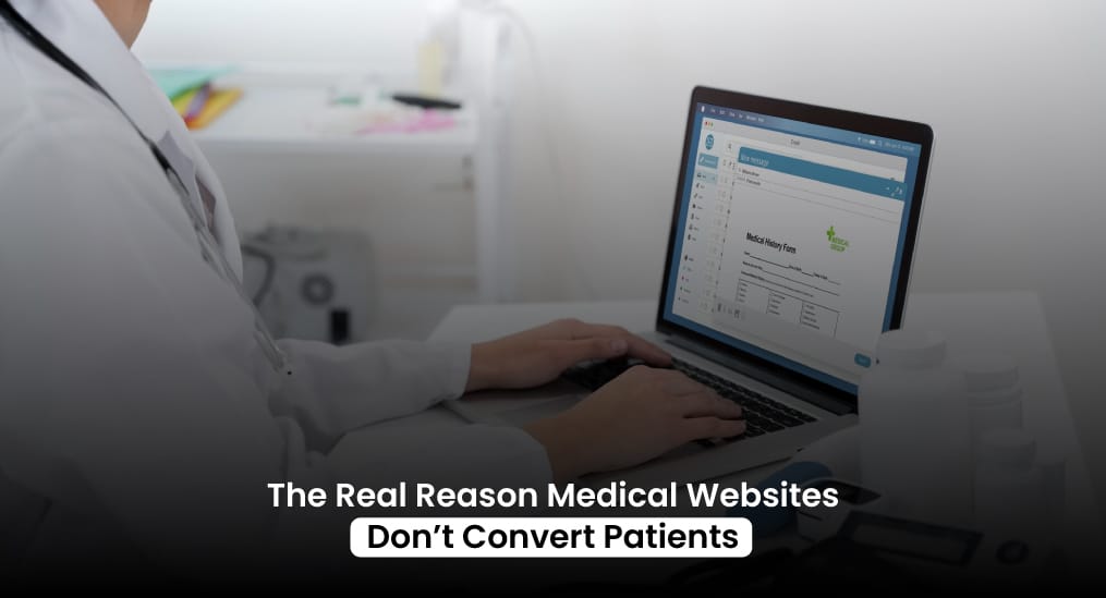
For a doctor website design should be captivating enough to turn every visitor into a patient. And for that to happen, that website has to do more than look good.
A website that confuses patients or makes booking hard is just a digital brochure because the real problem isn’t attracting visitors. The real problem is to guide them from curiosity to a confirmed patient appointment without friction.
A well-designed medical practice website should create clarity, build trust, and make it obvious what the next step is.
Why Most Medical Websites Don’t Convert Patients
Think about a patient landing on your medical practice website. They might be in pain, worried, or anxious. They don’t care about how many awards you’ve won or the length of your credentials list. They want to know if you can help them and how to get an appointment quickly.
A common mistake in doctor website design is treating the homepage like a brochure. Long paragraphs, multiple services crammed together, and tiny buttons hide the real goal. When someone has to hunt for the next step, they leave, and that becomes lost revenue. Every missed opportunity chips away at your schedule and your bottom line.
Your website should answer three questions immediately.
- Can you help me?
- Do you understand my problem?
- What do I do next?
Most medical websites fail to do this clearly. They overwhelm visitors with information that looks good on paper but confuses real people—much like how many service-based businesses struggle with retention, a problem we break down in our article on Why Catering Companies Lose Repeat Orders.
A Bad Experience Can Drive Your Customers Away
Many clinics focus on visuals. Big photos, sleek colors, and modern layouts are everywhere in medical website design. That’s nice, but it won’t fill a calendar. Patients respond to experience, not style.
A website that converts feels easy. Pages are simple to scan. Services are separate, readable, and obvious. Buttons like “Book Now” are everywhere, not just at the top. Every page nudges the visitor forward without being pushy.
If your website is slow, cluttered, or confusing, it doesn’t matter how pretty it looks. Visitors click away before they even get to the booking form. Healthcare website conversion drops the moment you make people think too hard.
For A Doctor Website Design Should Be Mobil-First
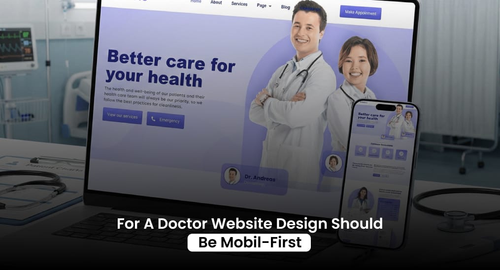
Over 60 percent of patients visit clinics from their phones. Yet many doctor website development projects treat mobile as an afterthought. Small text, slow load times, hard-to-tap buttons, and tiny forms make it nearly impossible for patients to act.
Booking an appointment on the phone should feel effortless. If it doesn’t, the patient tries the next clinic. Mobile isn’t a detail. It’s the main channel for most visitors. Your medical websites has to work on small screens as smoothly as on desktop. Every extra click or scroll reduces the chance of securing a patient appointment.
For A Patient, The Booking Experience Is Everything
Even if your website looks great and is easy to read, the final step often fails. Most clinics expect patients to call or fill long forms. That extra friction kills conversion. A booking website needs to make appointments fast and painless.
The number of fields on a form, the way availability is shown, and the speed of confirmation all matter. If the process of doctor website development is slow or confusing, potential patients bail. A simple, clear system turns interest into booked visits. Anything complicated loses trust and momentum.
Patients Decide Based On Trust, Not Tech Specs
Trust drives healthcare website conversion more than anything else. People aren’t buying a service. They are choosing someone to care for them. They notice how you communicate before they notice credentials.
Your clinic needs obvious trust signals. Practitioner bios with personality, photos of the space, real patient stories, and clear descriptions of what happens in the first visit make a difference. Those elements reduce anxiety and make patients comfortable booking online. A strong medical practice website blends credibility with approachability.
Even the wording matters. Skip medical jargon or overly technical explanations. Talk like you would to a patient in your office. They need clarity, not complexity. Simple, human language creates confidence.
What Most Clinics Miss
Most clinics build websites around what they want to show, not what patients actually need. They list every service but hide the buttons, forms, and cues that make booking simple. Patients often visit multiple times before deciding, and if the site doesn’t guide them at each stage, they leave without scheduling a patient appointment.
The bigger issue is what happens after the first click. Missed calls, slow follow-ups, and confusing forms cost more appointments than a poorly designed homepage. Even if a visitor fills out a form, delays in response or manual scheduling can kill momentum. This is where automation changes everything.
Medical Marketing Automation and Systems that handle enquiry capture, pre-qualify patients, send reminders, and schedule appointments automatically make sure no lead slips through the cracks. That’s why the best doctor website design thinks beyond pages and considers the entire patient journey, from first click to confirmed appointment.
How Doctor Website Design Support Real Conversion?
A website that converts isn’t just attractive. It works with the patient, step by step. Automation plays a huge role here. Booking forms that pre-fill information, chatbots that answer common questions instantly, and follow-up sequences that confirm appointments keep patients moving without waiting for staff intervention.
Top-performing Medical Websites link services to stories, show real patient experiences, and make the next step obvious. A booking website shouldn’t make anyone think. It quietly handles the repetitive work, so patients go from curious visitor to booked appointment smoothly. The combination of intuitive design and automation is what turns clicks into real results.
Think About Your Patient’s Journey On The Website
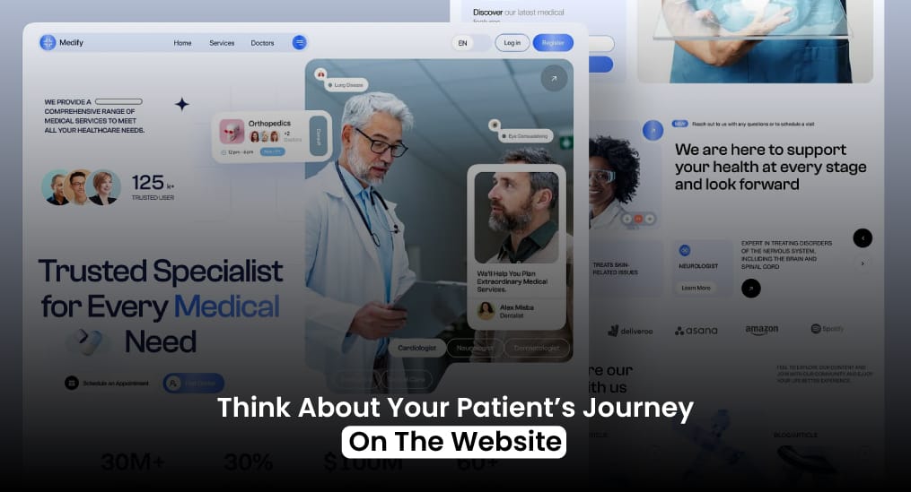
A website alone won’t fix poor intake, but when paired with automation, it changes the game. Even the cleanest doctor website design can’t rescue lost patients if enquiries sit in a manual queue or no one follows up. Automated systems capture leads instantly, confirm appointments, and send reminders to prevent no-shows.
Doctor website development today needs to cover the full journey:
- How patients discover your services
- How they interact with pages, forms, and CTAs
- How easily they can book without waiting on a call
- How quickly confirmations, reminders, and follow-ups happen
Automation ensures every patient moves through the journey efficiently, freeing staff from repetitive tasks while boosting booked appointments.
A Simple Medical Website Design Wins Everytime
Patients are busy, stressed, or in pain. They don’t want extra steps or complicated forms. The fewer clicks, the faster the answers, the higher the conversion. That’s why doctor website design focused on simplicity works better than flashy layouts or long text blocks.
Every element in a doctor website development should move the patient forward. Clear headings, scannable sections, prominent buttons, trust signals, and mobile usability are not optional extras. They are essential just as clarity and intent are critical in paid marketing, something we explore in Why Car Dealerships Waste Money on Google Ads.
Final Thoughts
The real reason Medical Websites fail is not that clinics are unqualified or patients don’t care. It’s that the website fails to guide visitors clearly from curiosity to action. Every unclear menu, buried service, or long form adds friction. Every friction point costs appointments.
When medical websites design aligns with patient behavior, visitors convert naturally. Pages that speak to patient concerns, clear booking paths, trust-building elements, and mobile-first experience create results. That’s the difference between a website that simply exists and a website that fills your schedule.
A strong doctor website design doesn’t just attract visitors. It captures their attention, builds trust, and drives action. Your calendar fills. Staff stress goes down. Patients book easily. That is exactly what a well-designed medical practice website achieves when it follows proven conversion principles, as explained in Why Most Medical Websites Fail to Convert Patients and How to Fix It. It is simple, direct, and human-focused.